Introduction
The human immune system is one of the most complex systems in the world—and one of its most important. It determines whether we survive infancy, which diseases we get, how we age, and how long we’ll live. Within it lies the secrets of who will respond, and how, to potential threats to our health. Understanding our immune system is the key to fighting disease and improving health for all. Yet its complexity has limited our ability to tap into its potential—until now.
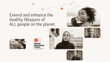
Human Immunome Project came to us with the task to update the brand to a more impactful, differentiated and inspiring one to communicate with the world. TND formulated a brand strategy, developed messaging that was clear, coherent and compelling as well as a new visual identity that stands out. We have also designed and created videos and social media assets with award winning scientists within the field.

Process
We started off by doing a brand audit and stakeholder interview to get more insights and context of the brand and define strengths and weaknesses. After getting to know the brand better we could define the opportunities for this new brand and formulate a clear, concise and differentiated positioning to base the brand and messaging on.
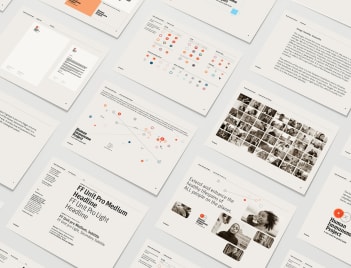
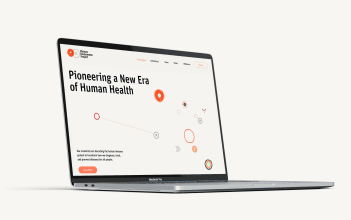
We created a new brand identity consisting of logotype, font, colors, brand guidelines, PowerPoint templates, social media posts and assets, and a style guide to be able to implement it on their website.
The Visual System
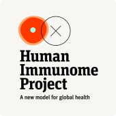
The Human Immunome Project logotype is part of a bigger universe, representing the main quests of the Human Immunome Project in a simplified, graphically reduced way. It embodies the powerful promise of the Human Immunome Project in two main ways:
On a micro level, it evokes how AI-powered science learns, analyzes and interacts with a cell. On a macro level, it represents how humanity is moving forward in step with analytical and scientific progress. The orange-red hand-drawn cell represents the human immune system/ humanity, and the clean circle next to it with the “x”-center point, stands for analytical, AI-powered science.
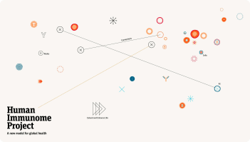
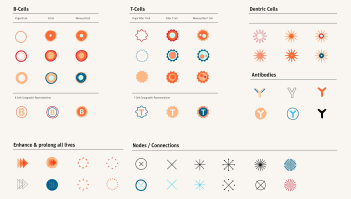
The logotype can also be shown as part of a bigger universe that includes representations of the gigantic puzzle full of components in complex systems. They loosely relate to different aspects of the Human Immunome Project: the human immune system, artificial intelligence, and human life. These symbols enrich the identity by creating a flexible active network of individual branding elements.


Impact
Getting a powerful brand that stands out will help get the brand and message out to the world —to investors, the industry, and the general public. Spreading the message and getting the funding will mean that this important work of mapping and understanding the immune system can continue, and hopefully, we will eliminate diseases connected to it in the future.
