Introduction
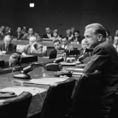
The significant legacy of Dag Hammarskjöld creates opportunities and benefits in the world through the 'Dag Hammarskjöld Foundation.'
The organization wanted a brand refresh and a new communicative expression for its annual 'Financial Report.' We wanted to help!
Process
To keep the already established brand while renewing and lifting the 'Dag Hammarskjöld Foundation,' we created a more extensive color palette, which would feel harmonic and modern. The aim was to elevate the classic iconic 'leaf' and give a sophisticated depth.

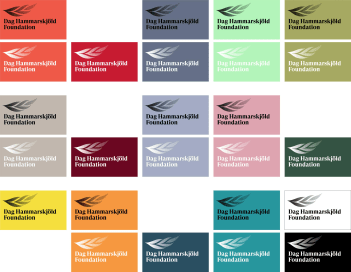
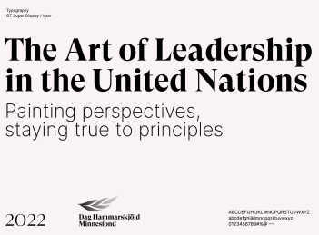
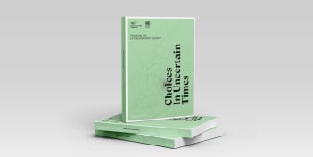
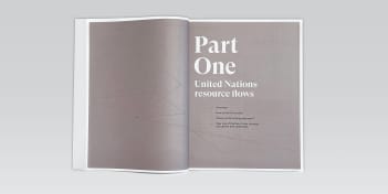
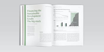
So, in addition to expanding the palette, we gave the leaf a new, gradual tone and changed the wordmark of the logo. The new look was then carried over into the new 'Financial report,' which gets a new color and front cover every year featuring a line-based illustration representing the theme of the report.
Change
We kept the iconic brand whilst giving it more weight by modernizing and focusing on elegance and sophistication. The new look is creating more unified content for the Dag Hammarskjöld Foundation's annual report and communication material across the board.
Quote from client
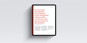
”We needed a more consistent graphic design that signals both clarity and credibility. It should be easily recognizable but also work well in collaboration with other organizations, as in the case of the report series ’Financing the UN Development System.’ We are very happy with the result.”